 |
BCGControlBar Pro for MFC
|
|
BCGControlBar Pro for MFC
|
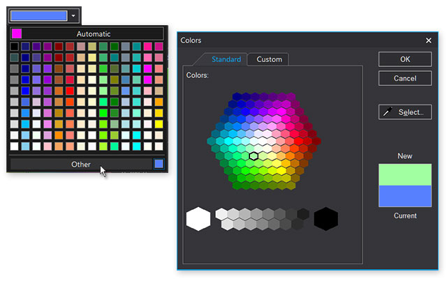
The CBCGPColorButton class is designed to allow easy integration with CBCGPColorBar object when you want to implement a color picker functionality in a dialog box. By default it behaves as a push button that opens a popup bar with the array of small color buttons and custom color picker. When a new color is selected the CBCGPColorButton automatically reflects the changes and displays the selected color.
The popup bar (CBCGPColorBar) is created during processing of OnLButtonDown message by calling OnShowColorPopup() method that may be overridden by derived class, allowing thus a custom color selection handling.
You can create a button control either from a dialog template as a regular button or directly in your code. In both cases, first call the constructor CBCGPColorButton to construct the CBCGPColorButton object; then call the Create() member function to create the Windows control and attach it to the CBCGPColorButton object. When you're using the ClassWizard to associate this control with a CDialog - derived class member you need to replace the CButton type to the CBCGPColorButton type.
The CBCGColorButton object notifies its parent about color changing by WM_COMMAND | BN_CLICKED notification. The parent may retrieve the current color by calling GetColor() method.
 Inheritance diagram for CBCGPColorButton:
Public Member Functions | ||
| CBCGPColorButton | Constructor. | |
| EnableAutomaticButton | Enables and disables "automatic" button that appears above the regular color buttons. | |
| EnableOtherButton | Enables and disables the "Other" button, which appears below the regular color buttons. | |
| GetAutomaticColor | Returns current automatic color. | |
| GetColor | Returns the currently selected color. | |
| IsDrawColorInDisabledControl | Tells whether a color box should be drawn in the disabled control. | |
| OnDrawPaletteColorBox | Called by the framework when the palette color box should be drawn. | |
| SetColor | Sets the current button's color. | |
| SetColors | Allows to specify a colors set to be displayed on the color bar as standard colors. | |
| SetColumnsNumber | Sets the number of columns on the popup color bar. | |
| SetDocumentColors | Allows to specify a list of RGB values to be displayed on the color bar as document colors. | |
| SetDrawColorInDisabledControl | Specifies whether a color box should be drawn in disabled in disabled control. | |
| SetPalette | Allows to specify a color palette to be displayed on the color bar as standard colors. | |
| SetWebColors | Allows to specify a standard Web colors to be displayed on the color bar. | |
| SizeToContent | Changes the size of the button's control according to its text and image size. | |
| Public Member Functions inherited from CBCGPButton | ||
| CleanUp | Frees the allocated resources | |
| ClearNumericNotificationBadge | Clears the numeric notification badge. | |
| EnableButton | Enables or disables the button. | |
| EnableFullTextTooltip | Allows to show tooltip even if there is enough space for the text on the button | |
| EnableMenuFont | Enables or disables using of the menu font when displaying the button's text | |
| GetDescription | Gets a description. | |
| GetNumericNotificationBadge | Gets a notification badge numeric value. | |
| GetNumericNotificationBadgeColor | Gets a notification badge background color. | |
| GetTooltip | Obtain the button's tooltip. | |
| GetToolTipCtrl | Gets a reference to the embedded tooltip control | |
| GetTooltipDescription | Obtain the button's description. | |
| IsAutoCheck | Tells whether a buttons is an auto-check or auto-radio button. | |
| IsAutoInverseIconsInDarkTheme | Tells whether the button's icon should be automatically inversed in the dark themes. | |
| IsAutorepeatCommandMode | Determines whether a button is working in autorepeat mode. | |
| IsCheckBox | Tells whether a button is a check-box button. | |
| IsHighlighted | Determines whether the button is highlighted | |
| IsImageAutoScale | Tells whether The button's image should be scaled according to current DPI. | |
| IsPressed | Determines whether the button is pressed | |
| IsPushed | Determines whether the button is pushed | |
| IsRadioButton | Tells whether a button is a radio button. | |
| IsToolTipIcon | Tells whether the button's icon is displayed on the tooltip. | |
| SetAutoInverseIconsInDarkTheme | Specifies whether the button's icon should be automatically inversed in the dark themes. | |
| SetAutorepeatMode | Puts a button in the autorepeat mode. | |
| SetCheckedImage | Specifies an SVG icon to be displayed on the checked button | |
| SetCheckedImage | Specifies an image to be displayed on the checked button | |
| SetCheckedImage | Specifies an image to be displayed on the checked button | |
| SetCheckedImage | Specifies an image to be displayed on the checked button | |
| SetDescription | Specified a new description. | |
| SetFaceColor | Sets a new background color | |
| SetImage | Specifies an image to be displayed on the button | |
| SetImage | Specifies an image to be displayed on the button | |
| SetImage | Specifies an image to be displayed on the button | |
| SetImage | Specifies an SVG icon to be displayed on the button | |
| SetImageAutoScale | The button's image should be scaled according to current DPI. | |
| SetMouseCursor | Specifies a new cursor hand image to be displayed on the button | |
| SetMouseCursorHand | Specifies a new cursor hand image to be displayed on the button | |
| SetNumericNotificationBadge | Sets a numeric notification badge. | |
| SetStdIcon | Set the button's image to be a standard stock icon. | |
| SetStdImage | Set the button's image to be a standard image taken from CBCGPMenuImages | |
| SetTemporaryDisabled | Make the push button temporarily disabled for the specified number of seconds. | |
| SetTextColor | Specifies a new text color for non-selected button's state | |
| SetTextHotColor | Specifies a new text color for selected button state | |
| SetTooltip | Specifies a new tooltip | |
Static Public Member Functions | ||
| SetColorName | Sets a color name. | |
| Static Public Member Functions inherited from CBCGPButton | ||
| EnableWinXPTheme | Allows to draw button borders using the current Windows theme. | |
Public Attributes | ||
| m_bEnabledInCustomizeMode | Indicates whether the color button is enabled in customization mode. | |
| Public Attributes inherited from CBCGPButton | ||
| m_bDrawFocus | If nonzero, a focus rectangle is drawn around the button's text and image when the button receives focus | |
| m_bHighlightChecked | Specifies whether to highlight buttons with the style BS_CHECKBOX or not when the mouse is hovered over. | |
| m_bOnGlass | Specifies whether a control is located on the "glass" (DWM) area of the parent window. | |
| m_bRighImage | If nonzero, the button's image is shown from the right side | |
| m_bTopImage | If nonzero, the button's image is shown on top | |
| m_bTransparent | If non-zero, the button is transparent. | |
| m_bVisualManagerStyle | Specifies whether a control has a Visual Manager style look. | |
| m_nAlignStyle | Specifies alignment of the button's text label. | |
| m_nFlatStyle | Specifies the button's flat style. | |
Protected Member Functions | ||
| OnDraw | Called by the framework to render an image of the button. | |
| OnDrawBorder | Called by the framework to display a border of the button. | |
| OnDrawFocusRect | Called by the framework to display a focus rectangle when the button has a focus. | |
| OnShowColorPopup | Called by the framework when the popup color bar is about to be displayed. | |
| UpdateColor | Called by the framework when the user selects a color from the color bar's palette. | |
| Protected Member Functions inherited from CBCGPButton | ||
| OnDrawImage | Called when a button's image should be redrawn. | |
| OnDrawNotificationBadge | Called when a button's notification badge should be redrawn. | |
| OnDrawText | Called when a button's text should be redrawn | |
| SelectFont | Called when a new font is about to be selected | |
Additional Inherited Members | ||
| Public Types inherited from CBCGPButton | ||
| enum | AlignStyle | |
| enum | FlatStyle | |
| Static Public Attributes inherited from CBCGPButton | ||
| m_bDontSetCapture | If this global flag is TRUE, SetCapture/ReleaseCapture methods are never called for all CBCGPButton controls. | |
| m_bUseTitleFontInCommandLinks | If this global flag is TRUE, the title of the command link will be drawn using a title (smaller than caption) font that makes control appearance closer to the standard Windows command link. | |