 |
BCGControlBar Pro for MFC
|
|
BCGControlBar Pro for MFC
|
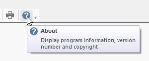
The CBCGPToolTipCtrl implements a custom tooltip control. It extends the standard tooltip control implementing the following features:
You can derive your own class from CBCGPToolTipCtrl and completely control tooltip behavior and rendering. Also, you can enable the above features using the CBCGPToolTipParams class.
How to use the tooltip control:
Inherits CToolTipCtrl.
Public Member Functions | ||
| GetIconSize | Returns icon size. | |
| GetParams | Returns tooltip parameters. | |
| OnDrawBorder | Called by the framework when it needs to draw tooltip border. | |
| OnDrawDescription | Called by the framework when it needs to draw tooltip description. | |
| OnDrawHelpPrompt | Called by the framework to draw help prompt. | |
| OnDrawIcon | Called by the framework when it needs to display tooltip icon. | |
| OnDrawLabel | Called by the framework when it needs to draw tooltip label. | |
| OnDrawSeparator | Called by the framework to draw separator between tooltip label and description. | |
| OnFillBackground | Called by the framework when it needs to fill the tooltip background. | |
| SetDescription | Sets description to be displayed by tooltip. | |
| SetParams | Sets tooltip parameters. | |