 |
BCGSuite for MFC
|
|
BCGSuite for MFC
|
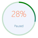
The CBCGPCircularProgressIndicatorImpl implements the functionality of a circular progress indicator.
A circular progress indicator contains the following elements (can be shown optionally):
To use a circular progress indicator in an application perform the following steps:
 Inheritance diagram for CBCGPCircularProgressIndicatorImpl:
Public Member Functions | ||
| CBCGPCircularProgressIndicatorImpl | Constructor. | |
| GetColors | Returns the gauge colors (color theme) | |
| GetLabel | Gets the text label. | |
| GetOptions | Returns the gauge options | |
| GetPos | Gets a progress bar position. | |
| GetRange | Gets the current lower and upper limits, or range, of the progress indicator. | |
| IsMarqueeStarted | Tells whether marquee animation was started. | |
| IsMarqueeStyle | Tells whether gauge has a marquee style. | |
| OffsetPos | Changes to the progress indicator current position by specifc offset. | |
| SetColors | Applies one of predefined color themes to the gauge. | |
| SetColors | Applies custom color theme to the gauge. | |
| SetLabel | Sets the text label. | |
| SetOptions | Applies options to the gauge. | |
| SetPos | Sets a progress position. | |
| SetRange | Sets the upper and lower limits of the progress indicator. | |
| SetStep | Specifies the step increment for a progress indicator. | |
| StartMarquee | Starts a marquee animation. | |
| StepIt | Advances the current position for a progress indicator by the step increment. | |
| Public Member Functions inherited from CBCGPCircularGaugeImpl | ||
| CBCGPCircularGaugeImpl | Constructor. | |
| AddPointer | Adds a new pointer. | |
| AddScale | Adds a new scale. | |
| AddSubGauge | Adds a sub-gauge. | |
| EnableEquidistantLabels | Enables/disables tick mark equidistant labels. | |
| EnableLabelsRotation | Enables/disables tick mark labels rotation around the gauge center. | |
| EnableShapeByTicksArea | Enables/disables gauge shape | |
| GetCapSize | Returns a gauge caps size. | |
| GetColors | Returns the circular gauge colors (color theme) | |
| GetColorTheme | Returns a currently selected color theme or (-1) if gauge has a custom theme. | |
| GetPointersCount | Returns the number of all gauge pointers. | |
| GetSubGaugeByID | Gets sub gauge by identifier. | |
| GetSubGauges | Gets all subgauges. | |
| GetTicksAreaFinishAngle | Returns scale finish angle. | |
| GetTicksAreaStartAngle | Returns scale start angle | |
| IsClosed | Tells whether scale has a closed range. | |
| IsEquidistantLabels | Tells whether tick mark labels are equidistant. | |
| IsLabelRotation | Tells whether tick mark labels are rotated around the gauge center. | |
| IsShapeByTicksArea | Returns TRUE if the gauge shape is specified by the scale angles | |
| IsShapeByTicksAreaBestFit | Tells whether the shape utilizes the most possible space in the shape by ticks area mode. | |
| ModifyPointer | Modifies the pointer appearance. | |
| RemoveAllSubGauges | Removes all sub-gauges. | |
| RemovePointer | Removes a pointer by index. | |
| RemoveSubGauge | Removes a sub-gauge. | |
| RotateScale | Rotate the circular gauge's scale to the specific angle. | |
| SetCapSize | Modify a gauge cap size. | |
| SetClosedRange | Sets closed range for the specified scale. | |
| SetColors | Applies one of predefined color themes to the gauge. | |
| SetColors | Applies custom color theme to the gauge. | |
| SetTicksAreaAngles | Defines scale angles. | |
| SetValue | Sets a gauge value. | |
| Public Member Functions inherited from CBCGPGaugeImpl | ||
| AddColoredRange | Adds a new colored range to a gauge. | |
| AddColoredRange | Adds a new colored range to a gauge. | |
| AddLevelBar | Adds a new level bar to a gauge. | |
| AddLevelBar | Adds a new level bar to a gauge. | |
| GetColoredRange | Returns a colored range for a scale. | |
| GetCornerRadius | Returns a gauge corner radius (in pixels). | |
| GetDefaultInteractivePointer | Retrieves an index of pointer used in the interactive mode by default. | |
| GetDefaultInteractiveScale | Retrieves an index of scale used in the interactive mode by default. | |
| GetFrameSize | Gets a gauge frame size (in pixels) | |
| GetLevelBar | Returns a level bar for a scale. | |
| GetLevelBarsCount | Gets level bars count. | |
| GetScale | Returns a scale for a gauge. | |
| GetTextFormat | Returns current text format of gauge labels. | |
| GetVisualEffects | Retrieves the gauge visual effects. | |
| IsInteractiveMode | Tells whether an interactive mode is active or not. | |
| RemoveAllColoredRanges | Removes all colored ranges. | |
| RemoveAllLevelBars | Removes all level bars. | |
| RemoveAllScales | Removes scales. | |
| RemoveLevelBar | Removes the level bar. | |
| RemoveScale | Removes a scale. | |
| SetCornerRadius | Specifies a gauge corner radius | |
| SetDefaultInteractivePointer | Specifies a pointer that will be used in the interactive mode by default. | |
| SetDefaultInteractiveScale | Specifies a scale that will be used in the interactive mode by default. | |
| SetFrameSize | Sets a gauge frame size (in pixels). | |
| SetInteractiveMode | Enabler or disables a gauge interactive mode. | |
| SetScaleOffsetFromFrame | Sets the scale offset from the gauge frame. | |
| SetTextFormat | Sets text format for gauge labels. | |
| SetTickMarkStyle | Specifies the gauge tick mark style. | |
| SetVisualEffects | Specifies the gauge visual effects. | |
| Public Member Functions inherited from CBCGPBaseVisualObject | ||
| CBCGPBaseVisualObject | Constructor. | |
| CBCGPBaseVisualObject | Copy constructor. | |
| CopyToClipboard | Copies visual object to the Clipboard. | |
| EnableImageCache | Enables or disables visual object image cache. | |
| EnableTranslation | Enables the translation of the hosted visual objects. | |
| ExportToBitmap | Exports the visual object to bitmap. | |
| ExportToFile | Exports the visual object to a file (BMP or PNG). | |
| ExportToImage | Exports the visual object to an image. | |
| GetData | Gets an internal data object. | |
| GetDataAnimationType | Gets data animation type. | |
| GetDataCount | Returns a number of data objects. | |
| GetEditFlags | Gets editing flags. | |
| GetID | Gets the object identifier. | |
| GetName | Gets the object name. | |
| GetParentContainer | Gets the parent visual container. | |
| GetRect | Gets the object bounding rectangle. | |
| GetSelectedTheme | Obtain a currently selected visual theme. | |
| GetUserData | Gets user-defined data associated with this object. | |
| GetValue | Gets the object value. | |
| GetVisualEffect | Retrieves a visual effect | |
| IsAutoDestroy | Tells whether this object will be destroyed automatically. | |
| IsEditMode | Tells whether this object has the edit mode. | |
| IsEnabled | Tells whether the visual object is enabled. | |
| IsImageCache | Tells whether image cache is enabled for this object. | |
| IsSelected | Tells whether this object is selected in the parent container. | |
| IsTranslation | Tells whether the hosted visual objects should be translated. | |
| IsVisible | Tells whether the visual object is visible. | |
| Redraw | Redraws this object. | |
| RedrawRect | Redraws a specified rectangle. | |
| SetAutoDestroy | Specifies whether the object should be destroyed automatically. | |
| SetDataAnimationType | Sets data animation type. | |
| SetEditFlags | Sets editing flags. | |
| SetFillBrush | Sets a new fill brush. | |
| SetID | Sets the object identifier. | |
| SetName | Sets an object name. | |
| SetSelected | Selects or unselects the object in the parent container. | |
| SetUserData | Sets user-defined data associated with this object. | |
| SetVisible | Shows or hides the visual object. | |
| SetVisualEffect | Sets a visual effect. | |
Additional Inherited Members | |
| Public Types inherited from CBCGPGaugeImpl | |
| enum | BCGP_SUB_GAUGE_POS |