 |
BCGControlBar Pro for MFC
|
|
BCGControlBar Pro for MFC
|
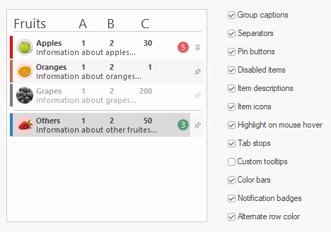
The CBCGPListBox class implements drawing of a list box control using Visual Manager. It's also designed to support drawing on DWM ("Glass") window area. In addition, this control supports the following features:
 Inheritance diagram for CBCGPListBox:
Public Member Functions | ||
| AddCaption | Adds a caption row. | |
| AddSeparator | Adds a separator. | |
| AreAutoToolTips | Tells whether the control has automatically created tooltips (appear in item when not enough space to display the whole text). | |
| BCGPModifyStyle | Recreates control with new styles. | |
| CleanUp | Clean up the control content. | |
| Enable | Enables/disabled item. | |
| EnableItemDescription | Enables the items description. | |
| EnableItemHighlighting | Enables the items highlighting. | |
| EnablePins | Enables the list items pin button. | |
| GetColorBarWidth | Gets color bar width. | |
| GetDefaultItem | Gets default item. | |
| GetItemBarColor | Gets item's bar color. | |
| GetItemDescription | Gets item's description. | |
| GetItemExtraHeight | Gets item extra height. | |
| GetItemIcon | Gets item icon. | |
| GetItemImage | Gets item image. | |
| GetItemImageSize | Gets item image size. | |
| GetItemIndent | Gets item indentation. | |
| GetItemNotificationBadgeColor | Gets item notification badge background color. | |
| GetItemNotificationBadgeNumber | Gets item's notification badge numeric value. | |
| GetItemToolTip | Gets item tooltip text. | |
| GetItemToolTipDescription | Gets item tooltip description. | |
| GetNoContentLabel | Gets a text label appearing in the middle of control when the list is empty. | |
| HasItemDescriptions | Checks if this control has items description. | |
| HasPins | Checks if this control has items pin button. | |
| IsAlternateRowColor | Tells whether this control has alternate (even/odd) row colors. | |
| IsAutoRecreated | Tells whether the control was automatically recreated ("owner draw" + "has strings" styles were added). | |
| IsCaptionItem | Tells whether a specified list box item is a caption item. | |
| IsCaptionItemsLargeFont | Tells whether caption items should be drawn using a large font. | |
| IsEnabled | Tells whether the item is enabled or not. | |
| IsItemHighlightingEnabled | Tells whether the item highlighting is enabled. | |
| IsItemPinned | Tells whether the item is pinned or not. | |
| IsSeparatorItem | Tells whether a specified list box item is a separator. | |
| RemoveItemNotificationBadge | Removes a notification badge associated with the item. | |
| ResetPins | Resets all pins. | |
| SetAlternateRowColor | Specifies whether this control has alternate (even/odd) row colors. | |
| SetAutoToolTips | Specifies whether the control has automatically created tooltips (appear in item when not enough space to display the whole text). | |
| SetCaptionItemsLargeFont | Specify whether caption items should be drawn using a large font. | |
| SetColorBarWidth | Sets color bar width. | |
| SetDefaultItem | Sets a default (bold) item. | |
| SetImageList | Sets image list. | |
| SetImageList | Sets image list. | |
| SetItemColorBar | Sets item's color bar. | |
| SetItemDescription | Sets item's description. | |
| SetItemExtraHeight | Sets list box item extra height. | |
| SetItemIcon | Sets item icon. | |
| SetItemImage | Sets item image. | |
| SetItemIndent | Sets item indentation (in pixels). | |
| SetItemNotificationBadge | Sets a numeric notification badge associated with the item. | |
| SetItemPinned | Sets item pinned state. | |
| SetItemToolTip | Sets item's tool tip. | |
| SetNoContentLabel | Specify a text label appearing in the middle of control when the list is empty. | |
Public Attributes | ||
| m_bOnGlass | Specifies whether a control is located on the "glass" (DWM) area of the parent window. | |
| m_bVisualManagerStyle | Specifies whether a control has a Visual Manager style look. | |
Protected Member Functions | ||
| OnAfterRecreate | Called by the framework after control was recreated by calling BCGPModifyStyle() method. | |
| OnCopyItemData | Called by the framework when control is recreated in BCGPModifyStyle() method. | |