 |
BCGControlBar Pro for MFC
|
|
BCGControlBar Pro for MFC
|
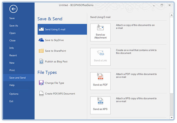
The CBCGPRibbonBackstageViewItemPropertySheet class implements functionality of a child property sheet placed on Backstage View. You should use this class when you need to associate a property sheet with a view entry in the list of items displayed at the left side of Backstage View.
A property sheet placed on Backstage View displays page tabs at the left side. It's possible to create groups of tabs. You can use CBCGPRibbonBackstageViewItemPropertySheet::AddGroup to add a group and CBCGPRibbonBackstageViewItemPropertySheet::AddPage to add a page.
The following example illustrates how to add a view with a property sheet to Backstage View:
 Inheritance diagram for CBCGPRibbonBackstageViewItemPropertySheet:
Public Member Functions | ||
| CBCGPRibbonBackstageViewItemPropertySheet | Constructor. | |
| AddGroup | Adds a group to property sheet. | |
| AddPage | Adds a page to property sheet. | |
| RemoveAll | Removes all pages and groups. | |
| Public Member Functions inherited from CBCGPRibbonBackstageViewItemForm | ||
| SetWaterMarkImage | Sets watermark image. | |
| Public Member Functions inherited from CBCGPBaseRibbonElement | ||
| CanBeAddedToContextMenu | Tells whether ribbon element can be added to context menu. | |
| CanBeRemovedFromQAT | Tells whether ribbon element can be removed from QAT. | |
| CanBeResizedInGroupVertically | Tells whether a ribbon element can be vertically resized in the parent group. | |
| GetApplicationModes | Gets application modes where this control is visible. | |
| GetBackstageAttachedView | Returns a ribbon element, which is placed at the right side of backstage and controlled by this ribbon element. | |
| GetCompactSize | Returns compact size of ribbon element. | |
| GetControlValue | Retrieves the ribbon control value | |
| GetCursor | Allows to specify a Ribbon control's custom mouse cursor. | |
| GetData | Retrieves a user-defined data associated with ribbon element. | |
| GetDescription | Returns ribbon element description. | |
| GetID | Returns ribbon element command ID. | |
| GetImageSize | Returns image size of ribbon element. | |
| GetIntermediateSize | Returns the size of ribbon element in "intermediate" state. | |
| GetKeys | Returns key tip associated with ribbon element. | |
| GetMenuKeys | Returns key tips associated with split button. | |
| GetRect | Returns bounding rectangle of ribbon element. | |
| GetSimplifiedModeType | Retrieves a ribbon element appearance in the Ribbon simplified mode. | |
| GetSize | Returns current size of ribbon element. | |
| GetText | Returns ribbon element text. | |
| GetToolTipText | Returns tooltip text of ribbon element. | |
| HasCompactMode | Tells whether the ribbon element has "compact mode". | |
| HasIntermediateMode | Tells whether the ribbon element has "intermediate mode". | |
| HasLargeMode | Tells whether the ribbon element has "large mode". | |
| IsBackstageViewMode | Tells whether a ribbon element works in "backstage view" mode. | |
| IsChecked | Tells whether ribbon element is checked. | |
| IsCompactMode | Tells whether ribbon element is in compact mode. | |
| IsDisabled | Tells whether ribbon element is disabled. | |
| IsDroppedDown | Tells whether ribbon element is dropped down (displays a popup menu). | |
| IsFocused | Tells whether ribbon element is focused. | |
| IsHiddenInFullMode | Tells whether a ribbon element is invisible in the Ribbon classic (non-simplified) mode. | |
| IsHighlighted | Tells whether ribbon element is highlighted. | |
| IsPressed | Tells whether ribbon element is pressed. | |
| OnDPIChanged | Called by the framework when the Ribbon DPI is changed | |
| OnShowPopupMenu | Called when ribbon element is going to display a popup menu. | |
| SetApplicationModes | Sets application modes where this control is visible. | |
| SetData | Associates a user-defined data with ribbon element. | |
| SetDescription | Sets ribbon element description. | |
| SetID | Sets command ID of ribbon element. | |
| SetKeys | Sets a key tip for ribbon element. | |
| SetSimplifiedModeType | Specifies a ribbon element appearance in the Ribbon simplified mode. | |
| SetText | Sets text to ribbon element. | |
| SetToolTipText | Sets tooltip text for ribbon element. | |
Additional Inherited Members | ||
| Public Types inherited from CBCGPBaseRibbonElement | ||
| enum | RibbonElementLocation | |
| enum | RibbonImageType | |
| enum | RibbonSimplifiedModeType | |
| Protected Member Functions inherited from CBCGPBaseRibbonElement | ||
| OnBeforeDestroyParentMenuBar | Called by the framework before the parent menu windo is destroyed. | |
| OnProcessKey | Called by the framework when a ribbon element should process keyboard input. | |
| OnSetFocus | Called by the framework when a ribbon element receives or loses the input focus. | |