 |
BCGControlBar Pro for MFC
|
|
BCGControlBar Pro for MFC
|
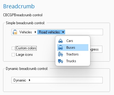
Breadcrumb control allows the user to explore hierarchical data, such as application-defined libraries or file directories. It may be compared with the tree-view control that does not show the whole items tree at once.
Breadcrumb Items
A breadcrumb item represents a single object of displayed hierarchy. The item has text and optionally an image. Any item in a breadcrumb control may have a list of subitems. An item that has one or more child items is called a parent item. A child item is displayed right to its parent. Parent items also have an arrow at the right of them. The items without children do not have such arrows.
Current Selection
The current selection is a breadcrumb item that the user has selected; the selected item is shown rightmost in the breadcrumb control.
Keyboard Support
Breadcrumb control can accept keyboard focus and allows navigation through its items. Left and right arrow keys move the highlight; up or down arrows show the menu for highlighted item if present. SPACE and ENTER keys select the highlighted item. When the menu is dropped down, all the standard menu keyboard navigation options are available. To leave the menu press ESC. Please note, that the control must have WS_TABSTOP style to allow the user to set focus on it using TAB key.
Creating Breadcrumb Control
The following code sample creates a breadcrumb control:
m_wndBreadcrumb.Create(WS_CHILD | WS_VISIBLE, rectBreadcrumb, this, IDC_BREADCRUMB);
Breadcrumb Window Styles
The following window styles are specific to breadcrumb controls:
Notification Messages
The following notification messages are supported:
Standard custom control notifications:
 Inheritance diagram for CBCGPBreadcrumb:
Public Member Functions | ||
| Create | Creates the breadcrumb control as the child control of specified window. | |
| DeleteItem | Deletes the specified item. | |
| EnableTooltip | Enables or disables breadcrumb item tooltip. | |
| GetBackColor | Returns background color of the breadcrumb control. | |
| GetDefaultHighlightColor | Returns default color of highlighted item background. | |
| GetDefaultHighlightedTextColor | Returns the default color of highlighted item text. | |
| GetDefaultTextColor | Returns the default color of item text. | |
| GetIconSize | Returns the icon size of the image list used with breadcrumb control. | |
| GetImageList | Returns the current image list used with breadcrumb control. | |
| GetItemData | Returns the application-defined value for the specified item. | |
| GetItemDynamic | Tells whether item is marked as dynamic or not. | |
| GetItemImageIndex | Returns image index for the specified item or (-1) if there's no image. | |
| GetItemParent | Retrieves parent of item. | |
| GetItemPath | Creates a path string for the specified item using the specified delimiter. | |
| GetItemText | Returns item text. | |
| GetItemTooltipText | Gets item tooltip text. | |
| GetProgress | Returns the progress value. | |
| GetRightMargin | Returns right margin. | |
| GetRootItem | Returns a handle to root item. | |
| GetSelectedItem | Returns a handle to currently selected item. | |
| GetSelectedPath | Returns path to selected item as string | |
| GetSubItem | Gets a subitem of an item. | |
| GetSubItemByName | Returns a handle to a child item with specified text. | |
| GetSubItemsCount | Returns the number of child items for the specified item. | |
| InsertItem | Inserts an item as a child of another item. | |
| IsInplaceEditActive | Tells whether the breadcrumb is in inplace editing mode now. | |
| IsOnGlass | Checks if control is located on DWM ("Glass") area of the parent window. | |
| IsTooltipEnabled | Tells whether breadcrumb item tooltip is enabled. | |
| OnDrawMenuImage | Called by the framework when a menu image is being rendered. | |
| RefreshDynamicItem | Refresh a breadcrumb node with dynamic sybitems. | |
| ResetContent | Deletes all breadcrumb items. | |
| SelectItem | Selects the specified item. | |
| SelectPath | Selects an item by string path. | |
| SelectSubPath | Select a subpath relative to the currently selected path. | |
| SetBackColor | Sets background color for the breadcrumb control. | |
| SetDefaultHighlightColor | Sets the background color used to paint the item under the mouse pointer. | |
| SetDefaultHighlightedTextColor | Sets color of text used to paint the item under the mouse pointer. | |
| SetDefaultTextColor | Sets the color of item text. | |
| SetImageList | Attaches an image list to Breadcrumb control. | |
| SetItemData | Associates the application-defined value with the specified item. | |
| SetItemDynamic | Marks the specified item as dynamic. | |
| SetItemImageIndex | Sets image index for specified item. | |
| SetItemText | Sets text for specified item. | |
| SetItemTooltipText | Sets item tooltip text. | |
| SetProgress | Sets the progress value. | |
| SetRightMargin | Sets right margin. | |
Public Attributes | ||
| m_bVisualManagerStyle | Specifies whether a control has a Visual Manager style look. | |
Protected Member Functions | ||
| GetItemChildrenDynamic | Called for items that marked as dynamic. | |
| OnInitRoot | Called when Breadcrumb control is successfully created. | |
| OnKeyDown | Called when the control has the keyboard focus and the user presses a key. | |
| OnLeftClick | Called when the user clicks left mouse button on the breadcrumb control. | |
| OnReturnKey | Called on Enter key. | |
| OnRightClick | Called when the user clicks right mouse button on the breadcrumb control. | |
| OnSelectionChanged | Called when the selected item has changed. | |