 |
BCGControlBar Pro for MFC
|
|
BCGControlBar Pro for MFC
|
The CBCGPButton class provides the extended functionality of the standard Windows button controls. It includes the new look & feel styles, the various ways to align text, ability to combine an image and text, set cursor and tool tip.
In addition, the CBCGPURLLinkButton derived from the CBCGPButton supports creation of Internet-style links, as well as CBCGPColorButton specially aimed to create Office-style color-filled button controls and color pickers.
The new look & feel styles are 3D, flat, semi-flat and no border styles. The text may be aligned at the left, top and center positions and when combined with image you can control at the run-time its appearance as text and image, text only and image only. You can assign a specific mouse cursor to be displayed when it is moved over the button.
You can create a button control either from a dialog template as a regular button or directly in your code. In both cases, first call the constructor CBCGPButton to construct the CBCGPButton object; then call the Create() member function to create the Windows control and attach it to the CBCGPButton object. When you're using the ClassWizard to associate this control with a CDialog - derived class member you need to replace the CButton type to the CBCGPButton type.
If you want to handle Windows notification messages, such as BN_CLICKED, sent by a button control to its parent (usually a class derived from CDialog), add to the CDialog - derived object a message-map entry and message-handler member function for each message. The notifications sent by a CBCGPButton object are the same as those sent by a CButton object.
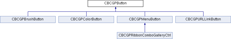
 Inheritance diagram for CBCGPButton:
Public Types | |
| enum | AlignStyle |
| enum | FlatStyle |
Public Member Functions | ||
| CleanUp | Frees the allocated resources | |
| ClearNumericNotificationBadge | Clears the numeric notification badge. | |
| EnableButton | Enables or disables the button. | |
| EnableFullTextTooltip | Allows to show tooltip even if there is enough space for the text on the button | |
| EnableMenuFont | Enables or disables using of the menu font when displaying the button's text | |
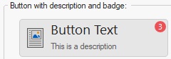
| GetDescription | Gets a description. | |
| GetNumericNotificationBadge | Gets a notification badge numeric value. | |
| GetNumericNotificationBadgeColor | Gets a notification badge background color. | |
| GetTooltip | Obtain the button's tooltip. | |
| GetToolTipCtrl | Gets a reference to the embedded tooltip control | |
| GetTooltipDescription | Obtain the button's description. | |
| IsAutoCheck | Tells whether a buttons is an auto-check or auto-radio button. | |
| IsAutoInverseIconsInDarkTheme | Tells whether the button's icon should be automatically inversed in the dark themes. | |
| IsAutorepeatCommandMode | Determines whether a button is working in autorepeat mode. | |
| IsCheckBox | Tells whether a button is a check-box button. | |
| IsHighlighted | Determines whether the button is highlighted | |
| IsImageAutoScale | Tells whether The button's image should be scaled according to current DPI. | |
| IsPressed | Determines whether the button is pressed | |
| IsPushed | Determines whether the button is pushed | |
| IsRadioButton | Tells whether a button is a radio button. | |
| IsToolTipIcon | Tells whether the button's icon is displayed on the tooltip. | |
| SetAutoInverseIconsInDarkTheme | Specifies whether the button's icon should be automatically inversed in the dark themes. | |
| SetAutorepeatMode | Puts a button in the autorepeat mode. | |
| SetCheckedImage | Specifies an SVG icon to be displayed on the checked button | |
| SetCheckedImage | Specifies an image to be displayed on the checked button | |
| SetCheckedImage | Specifies an image to be displayed on the checked button | |
| SetCheckedImage | Specifies an image to be displayed on the checked button | |
| SetDescription | Specified a new description. | |
| SetFaceColor | Sets a new background color | |
| SetImage | Specifies an image to be displayed on the button | |
| SetImage | Specifies an image to be displayed on the button | |
| SetImage | Specifies an image to be displayed on the button | |
| SetImage | Specifies an SVG icon to be displayed on the button | |
| SetImageAutoScale | The button's image should be scaled according to current DPI. | |
| SetMouseCursor | Specifies a new cursor hand image to be displayed on the button | |
| SetMouseCursorHand | Specifies a new cursor hand image to be displayed on the button | |
| SetNumericNotificationBadge | Sets a numeric notification badge. | |
| SetStdIcon | Set the button's image to be a standard stock icon. | |
| SetStdImage | Set the button's image to be a standard image taken from CBCGPMenuImages | |
| SetTemporaryDisabled | Make the push button temporarily disabled for the specified number of seconds. | |
| SetTextColor | Specifies a new text color for non-selected button's state | |
| SetTextHotColor | Specifies a new text color for selected button state | |
| SetTooltip | Specifies a new tooltip | |
| SizeToContent | Changes the size of the button's control according to its text and image size. | |
Static Public Member Functions | ||
| EnableWinXPTheme | Allows to draw button borders using the current Windows theme. | |
Public Attributes | ||
| m_bDrawFocus | If nonzero, a focus rectangle is drawn around the button's text and image when the button receives focus | |
| m_bHighlightChecked | Specifies whether to highlight buttons with the style BS_CHECKBOX or not when the mouse is hovered over. | |
| m_bOnGlass | Specifies whether a control is located on the "glass" (DWM) area of the parent window. | |
| m_bRighImage | If nonzero, the button's image is shown from the right side | |
| m_bTopImage | If nonzero, the button's image is shown on top | |
| m_bTransparent | If non-zero, the button is transparent. | |
| m_bVisualManagerStyle | Specifies whether a control has a Visual Manager style look. | |
| m_nAlignStyle | Specifies alignment of the button's text label. | |
| m_nFlatStyle | Specifies the button's flat style. | |
Static Public Attributes | ||
| m_bDontSetCapture | If this global flag is TRUE, SetCapture/ReleaseCapture methods are never called for all CBCGPButton controls. | |
| m_bUseTitleFontInCommandLinks | If this global flag is TRUE, the title of the command link will be drawn using a title (smaller than caption) font that makes control appearance closer to the standard Windows command link. | |
Protected Member Functions | ||
| OnDraw | Called by the framework when the button should be redrawn | |
| OnDrawBorder | Called by the framework when the button's border should be redrawn | |
| OnDrawFocusRect | Called when a button has focus to redraw the focus rectangle | |
| OnDrawImage | Called when a button's image should be redrawn. | |
| OnDrawNotificationBadge | Called when a button's notification badge should be redrawn. | |
| OnDrawText | Called when a button's text should be redrawn | |
| OnFillBackground | Called by the framework when the button's background should be filled | |
| SelectFont | Called when a new font is about to be selected | |