 |
BCGControlBar Pro for MFC
|
|
BCGControlBar Pro for MFC
|
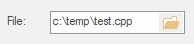
The CBCGPEdit class implements the functionality of a simple edit control with a browse button. There are four out-of-the-box modes:
You should to perform the following steps in order to incorporate the edit control in your application:
You can find an example of using CBCGPEdit in BCGPControls example, page3.cpp/h (misc controls).
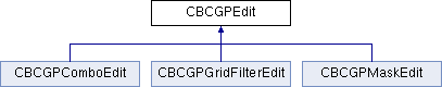
 Inheritance diagram for CBCGPEdit:
Public Member Functions | ||
| ClosePopupDlg | Called by the framework when the popup dialog is closed. | |
| EnableBrowseButton | Enables or disables the browse button. | |
| EnableCalculatorButton | Enables browse button and puts the edit control in "calculator mode". | |
| EnableFileBrowseButton | Enables browse button and puts the edit control in "file browse mode". | |
| EnableFolderBrowseButton | Enables browse button and puts the edit control in "folder browse mode". | |
| EnableIconOnLeft | Specifies whether icon should be displayed on the left side. | |
| EnablePasswordPreview | Enables the password preview mode. | |
| EnablePopupDialog | Enables drop button and puts the edit control in "popup dialog" mode. | |
| EnablePopupDialog | Enables drop button and puts the edit control in "popup dialog" mode. | |
| EnableSearchMode | Enables or disables search mode. | |
| EnableShellAutoComplete | Enables or disables the shell auto-complete drop-down list for this edit box. | |
| GetColorTheme | Gets edit box custom color theme. | |
| GetErrorMessage | Gets error message. | |
| GetMode | Returns the current browse mode. | |
| GetPrompt | Returns a prompt (displayed when the edit box text is empty). | |
| GetSearchPrompt | Returns a text string to be displayed in edit box in "search" mode. | |
| GetVerticalAlignment | Gets a text vertical alignment. | |
| IsDisableBrowseButtonInReadOnlyMode | Tells whether edit box "Browse" button is disabled in control read-only mode. | |
| IsDisableFrameAccelTableOnFocus | Tells whether to suppress handling of the keyboard accelerators in the top-level frame when the control is being focused. | |
| IsDroppedDown | Tells whether edit box has an active dropped-down list. | |
| IsIconOnLeftEnabled | Tells whether edit box has an icon on left. | |
| IsSearchMode | Specifies whether the edit control is working the "search" mode. | |
| IsSimplifiedBrowseIcon | Tells whether edit box "Browse" button's icon is simplified. | |
| OnBeforeShowPopupDlg | Called by the framework before the popup dialog is displayed. | |
| SetAutoCompleteListHighlightedColors | Specifies foreground and background colors of highlighted (marked) text parts in the auto-complete list. | |
| SetBrowseButtonImage | Allows to set a custom button image. | |
| SetBrowseButtonImage | Allows to set a custom button image. | |
| SetBrowseButtonImage | Allows to set a custom button image. | |
| SetBrowseButtonImage | Allows to set a custom button SVG icon. | |
| SetBrowseButtonToolTip | Sets browse button tool tip. | |
| SetColorTheme | Sets a custom color theme. | |
| SetDisableBrowseButtonInReadOnlyMode | Enables or disables edit box "Browse" button in control read-only mode. | |
| SetDisableFrameAccelTableOnFocus | Specifies whether to suppress handling of the keyboard accelerators in the top-level frame when the control is being focused. | |
| SetErrorMessage | Sets a custom error message. | |
| SetPrompt | Sets a prompt displayed when the edit box text is empty. | |
| SetSimplifiedBrowseIcon | Specifies whether edit box "Browse" button should have simplified icon. | |
| SetVerticalAlignment | Specifies a text vertical alignment (single-line only). | |
Public Attributes | ||
| m_bOnGlass | Specifies whether a control is located on the "glass" (DWM) area of the parent window. | |
| m_bVisualManagerStyle | Specifies whether a control has a Visual Manager style look. | |
Protected Member Functions | ||
| OnAfterUpdate | Called by the framework when the edit control has been updated with the result of browse action. | |
| OnBrowse | Called by the framework when the user has clicked the browse button. | |
| OnCalculatorUserCommand | Called by the framework when a custom calculator command should be executed. | |
| OnDrawBrowseButton | Called by the framework when it needs to draw the browse button. | |
| OnDrawImageOnLeft | Called by the framework when it needs to draw image (icon) of the left side. | |
| OnGetAutoCompleteList | This method is called by the framework when user types a text in "auto-complete" mode. | |
| OnIllegalFileName | Called by the framework when the edit control contains an illegal file name and this name is used in a file dialog. | |