 |
BCGControlBar Pro for MFC
|
|
BCGControlBar Pro for MFC
|
The CBCGPRibbonComboGalleryCtrl class allows to create drop-down galleries on dialogs in ribbon-based applications
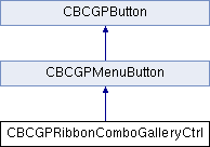
 Inheritance diagram for CBCGPRibbonComboGalleryCtrl:
Public Member Functions | ||
| CBCGPRibbonComboGalleryCtrl | Default constructor. | |
| AddCommand | Adds a command (located on top or bottom of the gallery). | |
| AddLabel | Adds a text label (static item) | |
| AddString | Adds a new item | |
| GetCount | Returns the number of items added to the gallery. | |
| GetCurSel | Retrieves the index of the currently selected item, if any, in gallery. | |
| ResetContent | Resets the content of the gallery. | |
| SetCurSel | Selects an item in a gallery control. | |
| SetIcons | Sets the icons list. | |
| Public Member Functions inherited from CBCGPMenuButton | ||
| CBCGPMenuButton | Constructs a CBCGPMenuButton object. | |
| ClosePopupDlg | Called by the framework when the popup dialog is closed. | |
| EnablePopupDialog | Enables the popup dialog associated with this button. | |
| EnablePopupDialog | Enables the popup dialog associated with this button. | |
| OnBeforeShowPopupDlg | Called by the framework before the popup dialog is displayed. | |
| SetupMenu | Sets up the menu button content and appearance. | |
| SizeToContent | Changes the size of the button's control according to its text and image size. | |
| Public Member Functions inherited from CBCGPButton | ||
| CleanUp | Frees the allocated resources | |
| ClearNumericNotificationBadge | Clears the numeric notification badge. | |
| EnableButton | Enables or disables the button. | |
| EnableFullTextTooltip | Allows to show tooltip even if there is enough space for the text on the button | |
| EnableMenuFont | Enables or disables using of the menu font when displaying the button's text | |
| GetDescription | Gets a description. | |
| GetNumericNotificationBadge | Gets a notification badge numeric value. | |
| GetNumericNotificationBadgeColor | Gets a notification badge background color. | |
| GetTooltip | Obtain the button's tooltip. | |
| GetToolTipCtrl | Gets a reference to the embedded tooltip control | |
| GetTooltipDescription | Obtain the button's description. | |
| IsAutoCheck | Tells whether a buttons is an auto-check or auto-radio button. | |
| IsAutoInverseIconsInDarkTheme | Tells whether the button's icon should be automatically inversed in the dark themes. | |
| IsAutorepeatCommandMode | Determines whether a button is working in autorepeat mode. | |
| IsCheckBox | Tells whether a button is a check-box button. | |
| IsHighlighted | Determines whether the button is highlighted | |
| IsImageAutoScale | Tells whether The button's image should be scaled according to current DPI. | |
| IsPressed | Determines whether the button is pressed | |
| IsPushed | Determines whether the button is pushed | |
| IsRadioButton | Tells whether a button is a radio button. | |
| IsToolTipIcon | Tells whether the button's icon is displayed on the tooltip. | |
| SetAutoInverseIconsInDarkTheme | Specifies whether the button's icon should be automatically inversed in the dark themes. | |
| SetAutorepeatMode | Puts a button in the autorepeat mode. | |
| SetCheckedImage | Specifies an SVG icon to be displayed on the checked button | |
| SetCheckedImage | Specifies an image to be displayed on the checked button | |
| SetCheckedImage | Specifies an image to be displayed on the checked button | |
| SetCheckedImage | Specifies an image to be displayed on the checked button | |
| SetDescription | Specified a new description. | |
| SetFaceColor | Sets a new background color | |
| SetImage | Specifies an image to be displayed on the button | |
| SetImage | Specifies an image to be displayed on the button | |
| SetImage | Specifies an image to be displayed on the button | |
| SetImage | Specifies an SVG icon to be displayed on the button | |
| SetImageAutoScale | The button's image should be scaled according to current DPI. | |
| SetMouseCursor | Specifies a new cursor hand image to be displayed on the button | |
| SetMouseCursorHand | Specifies a new cursor hand image to be displayed on the button | |
| SetNumericNotificationBadge | Sets a numeric notification badge. | |
| SetStdIcon | Set the button's image to be a standard stock icon. | |
| SetStdImage | Set the button's image to be a standard image taken from CBCGPMenuImages | |
| SetTemporaryDisabled | Make the push button temporarily disabled for the specified number of seconds. | |
| SetTextColor | Specifies a new text color for non-selected button's state | |
| SetTextHotColor | Specifies a new text color for selected button state | |
| SetTooltip | Specifies a new tooltip | |
Additional Inherited Members | ||
| Public Types inherited from CBCGPButton | ||
| enum | AlignStyle | |
| enum | FlatStyle | |
| Static Public Member Functions inherited from CBCGPButton | ||
| EnableWinXPTheme | Allows to draw button borders using the current Windows theme. | |
| Public Attributes inherited from CBCGPMenuButton | ||
| m_bOSMenu | Specifies whether to show the default system menu or BCGControlBar Library menu | |
| m_bPostCommand | Specifies whether the control calls PostMessage instead of SendMessage for notifying the WM_COMMAND. | |
| m_bRightArrow | Determines the arrow direction. | |
| m_bStayPressed | Determines the menu button state when after the user has released the button. | |
| m_hMenu | A handle to Windows menu. | |
| m_nMenuResult | A menu-item identifier. | |
| Public Attributes inherited from CBCGPButton | ||
| m_bDrawFocus | If nonzero, a focus rectangle is drawn around the button's text and image when the button receives focus | |
| m_bHighlightChecked | Specifies whether to highlight buttons with the style BS_CHECKBOX or not when the mouse is hovered over. | |
| m_bOnGlass | Specifies whether a control is located on the "glass" (DWM) area of the parent window. | |
| m_bRighImage | If nonzero, the button's image is shown from the right side | |
| m_bTopImage | If nonzero, the button's image is shown on top | |
| m_bTransparent | If non-zero, the button is transparent. | |
| m_bVisualManagerStyle | Specifies whether a control has a Visual Manager style look. | |
| m_nAlignStyle | Specifies alignment of the button's text label. | |
| m_nFlatStyle | Specifies the button's flat style. | |
| Static Public Attributes inherited from CBCGPButton | ||
| m_bDontSetCapture | If this global flag is TRUE, SetCapture/ReleaseCapture methods are never called for all CBCGPButton controls. | |
| m_bUseTitleFontInCommandLinks | If this global flag is TRUE, the title of the command link will be drawn using a title (smaller than caption) font that makes control appearance closer to the standard Windows command link. | |
| Protected Member Functions inherited from CBCGPButton | ||
| OnDrawBorder | Called by the framework when the button's border should be redrawn | |
| OnDrawFocusRect | Called when a button has focus to redraw the focus rectangle | |
| OnDrawImage | Called when a button's image should be redrawn. | |
| OnDrawText | Called when a button's text should be redrawn | |
| OnFillBackground | Called by the framework when the button's background should be filled | |
| SelectFont | Called when a new font is about to be selected | |