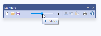
The CBCGPToolbarSlider object encapsulates the functionality of a slider control. It allows to embed a slider into toolbar buttons and put them on toolbars created using BCGControlBar Library framework.
|
| | CBCGPToolbarSlider | Constructs a CBCGPToolbarSlider object. |
| |
| | EnableProgressMode | Enables the progress mode. |
| |
| | EnableZoomButtons | Enables the zoom buttons. |
| |
| | GetReversedOrder | Tells whether slider's ticks have a reversed order. |
| |
| | GetValue | Reurns a slider's value. |
| |
| | HasZoomButtons | Tells whether the control has zoom buttons. |
| |
| | IsProgressMode | Tells whether the control's progress mode is enabled. |
| |
| | IsSetPositionOnClick | Tells whether thumb should be moved to the mouse click location when user clicks the slider's channel. |
| |
| | SetPositionOnClick | Specifies whether thumb should be moved to the mouse click location when user clicks the slider's channel. |
| |
| | SetRange | Specifies a slider's range. |
| |
| | SetReversedOrder | Specifies whether slider's ticks have a reversed order. |
| |
| | SetValue | Sets a value. |
| |
| | CBCGPToolbarButton | Constructs and initializes a CBCGPToolbarButton object. |
| |
| | CanBeDropped | Indicates whether a button can be dropped on a toolbar. |
| |
| | ExportToMenuButton | Called by the framework to copy the toolbar button into a menu button. |
| |
| | GetImage | Returns a toolbar button's image. |
| |
| | GetTextSize | Returns the size (in pixels) of the button text. |
| |
| | IsDrawImage | Tells whether a button's image is displayed. |
| |
| | IsDrawText | Tells whether a button's text label is displayed. |
| |
| | IsEditable | Tells whether a button is customizable or not. |
| |
| | IsExtraSize | Determines whether the border's extra size should be taken into account. |
| |
| | IsHidden | Tells whether a button is hidden or not. |
| |
| | IsLocked | Returns a flag indicating whether a button belongs to the locked (non-customizable) toolbar and can't be customized (dragged, dropped or edited). |
| |
| | IsOnGlass | Checks if button is located on DWM ("Glass") area of the parent toolbar. |
| |
| | IsVisible | Determines whether a toolbar button is visible or not. |
| |
| | NotifyCommand | Called by the framework when the WM_COMMAND message is about to be send to a parent window. |
| |
| | OnBeforeDrag | Called by the framework before user begins to drag the button. |
| |
| | OnBeforeDrop | Called by the framework before button is dropped on target. |
| |
| | OnClick | Called by the framework when the user clicks the button. |
| |
| | OnClickUp | Called by the framework when the user releases the toolbar button. |
| |
| | OnContextHelp | Called by the framework when the parent toolbar processes the WM_HELPHITTEST message. |
| |
| | OnCtlColor | Called by the framework when the parent toolbar processes OnCtlColor. |
| |
| | OnDblClick | Called by the framework when the parent toolbar handles OnLButtonDblClk. |
| |
| | OnGetCustomToolTipText | Called by the framework when it needs to display a tooltip for the toolbar button. |
| |
| | OnGlobalFontsChanged | Called by the framework when the global font has been changed. |
| |
| | OnToolHitTest | Called by the framework when the parent toolbar needs to determine whether a point is in the bounding rectangle of the specified tool. |
| |
| | Rect | Returns a buttons' bounding rectangle. |
| |
| | SetImage | Sets a button's image. |
| |
| | SetRadio | Called by the framework when a button changes its check state. |
| |
| | SetRect | Sets a new button's bounding rectangle. |
| |
| | SetVisible | Shows or hides a toolbar button. |
| |
| | Show | Makes a button visible or hidden. |
| |
|
| | m_bImage | Indicates whether the image of the toolbar button is displayed or not. |
| |
| | m_bText | Indicates whether the text label of the toolbar button is displayed or not. |
| |
| | m_bTextBelow | Indicates whether the button's text label is displayed below the image. |
| |
| | m_bUserButton | Indicates whether a button has the user-defined image (TRUE) or not (FALSE). |
| |
| | m_bWholeText | Indicates whether a button displays full text label (TRUE), or clips the text and replace the rest by "..." if the text doesn't fit to the bounding rectangle. |
| |
| | m_bWrap | If this flag is TRUE for a separator, the next to the separator button will be placed on the next row. |
| |
| | m_nID | Contains the command ID of a button. |
| |
| | m_nStyle | Contains the style of a toolbar button. |
| |
| | m_strText | Contains the text label of a button. |
| |
| | m_bWrapText | If TRUE, enables multi-line text labels. |
| |

 Inheritance diagram for CBCGPToolbarSlider: