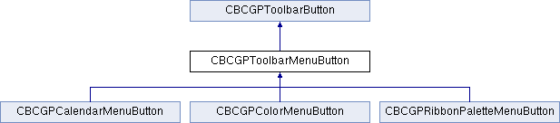
The CBCGPToolbarMenuButton class extends the functionality of the regular CBCGPToolbarButton.
A CBCGPToolbarMenuButton object can represent the following button types:
- a regular menu item
- a menu item with a sub-menu
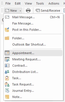
- a tool bar button with a submenu; in this case the button has a small arrow near the text or image. When the user clicks the button the submenu is displayed
- a tool bar button, which executes a default command or displays a popup menu; in this case the button has a small arrow separated from the text or image. When the user presses the arrow, the submenu is displayed; otherwise the default button's command is executed.
The type of the button is detected automatically, according to the constructor's parameters.
|
| | CBCGPToolbarMenuButton | Copy constructor. |
| |
| | CBCGPToolbarMenuButton | Constructs a CBCGPToolbarMenuButton object. |
| |
| | CreateFromMenu | Creates a button's submenu from a handle to Windows menu. |
| |
| | CreateMenu | Creates a Windows menu from a list of commands associated with the toolbar menu button. |
| |
| | CreatePopupMenu | Called by the framework when a submenu associated with the toolbar menu button is being displayed. |
| |
| | GetCommands | Gives read-only access to the list of commands associated with the toolbar menu button. |
| |
| | GetImageRect | Retrieves a rectangular area where the button's image is displayed. |
| |
| | GetPaletteRows | Returns the number of rows for the drop-down menu working in palette mode. |
| |
| | GetPopupMenu | Returns a pointer to the button's popup menu. |
| |
| | IsDroppedDown | Returns nonzero when the toolbar menu button's submenu is displayed. |
| |
| | IsEmptyMenuAllowed | Called by the framework to determine if it's possible to open a submenu from the currently selected menu item. |
| |
| | IsExclusive | Tells the framework whether a button is working in exclusive mode or not. |
| |
| | IsMenuPaletteMode | Tells whether the drop-down menu, associated with the menu button, is in palette mode. |
| |
| | IsTearOffMenu | Returns nonzero if the toolbar menu button can have tear-off state. |
| |
| | OnClickMenuItem | Called by the framework when the user selects (clicks) a menu item. |
| |
| | OpenPopupMenu | Called by the framework when the user selects the toolbar menu button and it is required to open a popup menu. |
| |
| | SetMenuOnly | Enables or disables "menu only" mode. |
| |
| | SetMenuPaletteMode | Sets a drop-down menu, associated with the menu button to palette mode. |
| |
| | SetRadio | Forces the toolbar menu button to display the radio-button image. |
| |
| | SetTearOff | Sets a new tear-off bar ID. |
| |
| | CBCGPToolbarButton | Constructs and initializes a CBCGPToolbarButton object. |
| |
| | CanBeDropped | Indicates whether a button can be dropped on a toolbar. |
| |
| | CanBeStretched | Indicates whether a button can be stretched in customization mode. |
| |
| | ExportToMenuButton | Called by the framework to copy the toolbar button into a menu button. |
| |
| | GetControlValue | Retrieves the toolbar control value |
| |
| | GetHwnd | Returns a handle to a window associated with a toolbar button. |
| |
| | GetImage | Returns a toolbar button's image. |
| |
| | GetTextSize | Returns the size (in pixels) of the button text. |
| |
| | IsDrawImage | Tells whether a button's image is displayed. |
| |
| | IsDrawText | Tells whether a button's text label is displayed. |
| |
| | IsEditable | Tells whether a button is customizable or not. |
| |
| | IsExtraSize | Determines whether the border's extra size should be taken into account. |
| |
| | IsHidden | Tells whether a button is hidden or not. |
| |
| | IsLocked | Returns a flag indicating whether a button belongs to the locked (non-customizable) toolbar and can't be customized (dragged, dropped or edited). |
| |
| | IsOnGlass | Checks if button is located on DWM ("Glass") area of the parent toolbar. |
| |
| | IsVisible | Determines whether a toolbar button is visible or not. |
| |
| | NotifyCommand | Called by the framework when the WM_COMMAND message is about to be send to a parent window. |
| |
| | OnBeforeDrop | Called by the framework before button is dropped on target. |
| |
| | OnClickUp | Called by the framework when the user releases the toolbar button. |
| |
| | OnCtlColor | Called by the framework when the parent toolbar processes OnCtlColor. |
| |
| | OnDblClick | Called by the framework when the parent toolbar handles OnLButtonDblClk. |
| |
| | OnDPIChanged | Called by the framework when the parent toolbar DPI is changed |
| |
| | OnGetCustomToolTipText | Called by the framework when it needs to display a tooltip for the toolbar button. |
| |
| | OnGlobalFontsChanged | Called by the framework when the global font has been changed. |
| |
| | OnMove | Called by the framework when the parent toolbar is moved. |
| |
| | OnShow | Called by the framework to notify the button that it becomes visible or invisible. |
| |
| | OnSize | Called by the framework to notify the button that its parent toolbar has changed its size and/or position and the button should resize itself accordingly. |
| |
| | OnToolHitTest | Called by the framework when the parent toolbar needs to determine whether a point is in the bounding rectangle of the specified tool. |
| |
| | Rect | Returns a buttons' bounding rectangle. |
| |
| | SetImage | Sets a button's image. |
| |
| | SetRect | Sets a new button's bounding rectangle. |
| |
| | SetStyle | Sets a new button's style. |
| |
| | SetVisible | Shows or hides a toolbar button. |
| |
| | Show | Makes a button visible or hidden. |
| |
|
| | GetProtectedCommands | Returns a reference to CList object, which contains a collection of commands that can't be customized by the user. |
| |
| | SetProtectedCommands | Sets a list of protected commands. |
| |
| | m_bImage | Indicates whether the image of the toolbar button is displayed or not. |
| |
| | m_bText | Indicates whether the text label of the toolbar button is displayed or not. |
| |
| | m_bTextBelow | Indicates whether the button's text label is displayed below the image. |
| |
| | m_bUserButton | Indicates whether a button has the user-defined image (TRUE) or not (FALSE). |
| |
| | m_bWholeText | Indicates whether a button displays full text label (TRUE), or clips the text and replace the rest by "..." if the text doesn't fit to the bounding rectangle. |
| |
| | m_bWrap | If this flag is TRUE for a separator, the next to the separator button will be placed on the next row. |
| |
| | m_nID | Contains the command ID of a button. |
| |
| | m_nStyle | Contains the style of a toolbar button. |
| |
| | m_strText | Contains the text label of a button. |
| |

 Inheritance diagram for CBCGPToolbarMenuButton: