 |
BCGControlBar Pro for MFC
|
|
BCGControlBar Pro for MFC
|
The CBCGPToolBar class extends the MFC toolbar control by providing support for a number of features:
CBCGPToolBar is the base class for several important BCGControlBar Library classes CBCGPMenuBar, CBCGPPopupMenuBar, CBCGPDropDownToolBar.
To incorporate CBCGPToolBar into your application, you need to perform the following steps:
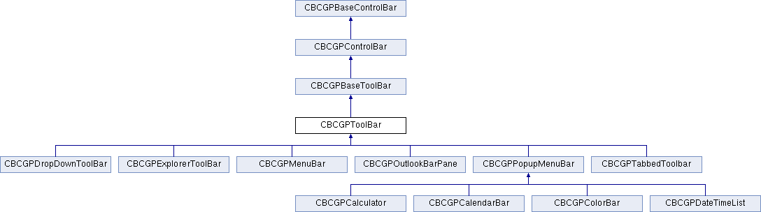
 Inheritance diagram for CBCGPToolBar:
Public Types | |
| enum | CustomizeButtonStyle |
Public Member Functions | ||
| AdjustLayout | Recalculates and adjusts the size and location of a toolbar. | |
| AllowChangeTextLabels | Returns nonzero if the toolbar object permits to display text labels below images on the toolbar buttons. | |
| AreTextLabels | Tells whether toolbar buttons should display text labels below images. | |
| ButtonToIndex | Given a pointer to CBCGPToolbarButton object returns the button's index. | |
| CanBeClosed | Returns nonzero if the toolbar can be closed by the user. | |
| CanBeRestored | Returns nonzero if the application can revert a toolbar to its original state after customization. | |
| CommandToIndex | Given a toolbar button's command ID returns the button's index. | |
| Create | Creates the control bar control and attaches it to a CBCGPToolBar object. | |
| CreateEx | Creates a CBCGPToolBar object with additional styles. | |
| EnableCustomizeButton | Enables or disables an additional "customize" button on the toolbar. | |
| EnableCustomizeButton | Enables or disables an additional "customize" button on the toolbar. | |
| EnableCustomizeButton | Enables or disables an additional "customize" button on the toolbar. | |
| EnableLargeIcons | Enables and disables large icons (images) on toolbar buttons. | |
| EnableTextLabels | Enables and disables text labels below toolbar button's images. | |
| GetAllButtons | Gives read-only access to the internal list of toolbar buttons. | |
| GetButton | Given an index returns a toolbar button. | |
| GetButtonByCommand | Given an command ID returns a toolbar button. | |
| GetButtonInfo | Given an index of toolbar button, returns an information about this button. | |
| GetButtonSize | Returns the current size of a toolbar's buttons. | |
| GetButtonStyle | Returns a style of a toolbar button. | |
| GetButtonText | Returns a text label of a toolbar button. | |
| GetButtonText | Returns a text label of a toolbar button. | |
| GetColumnWidth | Returns the width of toolbar buttons. | |
| GetControlValue | Retrieves the toolbar item value (e.g., text of the edit box). | |
| GetCount | Returns a number of buttons on a toolbar. | |
| GetGrayDisabledButtons | Tells whether the images of the toolbar's disabled buttons should be grayed out or taken from the collection of disabled images. | |
| GetHighlightedButton | Returns a highlighted toolbar button. | |
| GetHotBorder | Tells whether the border presentation appears or not. | |
| GetHwndLastFocus | Returns a handle to window that previously had the input focus. | |
| GetImageSize | Retrieves the size of toolbar images. | |
| GetImagesOffset | Retrieves the offset of the toolbar images in the shared (global) collection of toolbar images. | |
| GetItemID | Given a toolbar button's index retrieves the button's command ID. | |
| GetItemRect | Given a toolbar button's index returns the button's bounding rectangle. | |
| GetRouteCommandsViaFrame | Determines whether the toolbar commands are routed via its direct owner (if not NULL) or via the parent frame. | |
| GetRowHeight | Returns the height of toolbar buttons. | |
| HideEmptyMenus | Specifies whether toolbar/menu bar items with an empty items should be hidden. | |
| HitTest | Determines which toolbar button is at a specified position. | |
| InsertButton | Inserts a button into list of toolbar buttons. | |
| InsertSeparator | Insets the separator at a specified position. | |
| IsButtonExtraSizeAvailable | Determines whether the toolbar can display buttons with the extra border size. | |
| IsHideEmptyMenus | Tells whether toolbar/menu bar items with an empty items should be hidden. | |
| IsToolBarImagesInDropDownMenus | Tells whether toolbar images should be displayed in drop-down menus. | |
| IsUserDefined | Determines whether a toolbar is the user-defined toolbar. | |
| LoadBitmap | Loads toolbar images from the application resources. | |
| LoadBitmapEx | Loads toolbar images from the application resources including large images. | |
| LoadState | Loads a toolbar state from the Windows registry. | |
| LoadToolBar | Loads toolbar from the resources. | |
| LoadToolBarEx | Loads toolbar images from the resources using CBCGPToolBarParams helper that allows to handle large images. | |
| OnChangeHot | Called when a toolbar's currently selected button is about to change. | |
| OnCreateButton | called by the framework to create a toolbar button or control from the XML node. | |
| OnFillBackground | Called when a toolbar's background has been filled. | |
| OnReset | Called when a toolbar is reverted to its original state. | |
| OnSetDefaultButtonText | Called when a toolbar button's default text is being restored. | |
| OnUserToolTip | Called when a toolbar button's tooltip is about to be displayed. | |
| RemoveAllButtons | Removes all buttons from a toolbar. | |
| RemoveButton | Removes a button from a toolbar. | |
| RemoveStateFromRegistry | Removes a toolbar's state from the Windows registry. | |
| ReplaceButton | Replaces a toolbar button with another toolbar button. | |
| ResetImages | Reset all toolbar images except user-defined to the default state. | |
| RestoreOriginalstate | Restores an original state of a toolbar. | |
| SaveState | Stores a toolbar's state into the Windows registry. | |
| SetButtonInfo | Sets properties for a toolbar button. | |
| SetButtons | Removes existing buttons from a toolbar and inserts a collection of new buttons. | |
| SetButtonStyle | Sets a new style for a toolbar button. | |
| SetButtonText | Sets a new text label for a toolbar button. | |
| SetGrayDisabledButtons | Sets a special mode, when images of disabled buttons are grayed or taken from a collection of disabled images. | |
| SetHeight | Call this function to set the height of a toolbar. | |
| SetHotBorder | Sets a flag indicating whether toolbar buttons are hot-tracked or not. | |
| SetLockedSizes | Sets the size of locked toolbar buttons and locked images. | |
| SetPermament | Sets a flag indicating that a toolbar is permanent and can't be closed. | |
| SetRouteCommandsViaFrame | Sets a flag indicating whether the toolbar commands are routed via its direct owner (if not NULL) or via the parent frame. | |
| SetToolBarBtnText | Sets a new text label to the specified toolbar button, and specifies whether the toolbar button's text and image should be displayed or not. | |
| SetUseToolBarImagesInDropDownMenus | Specifies whether toolbar images should be used in drop-down menus. | |
| Public Member Functions inherited from CBCGPControlBar | ||
| AdjustSizeImmediate | Immediately recalculates layout of a control bar. | |
| CalcInsideRect | Calculates the inside rectangle of a control bar taking into account the borders and grippers. | |
| CanBeDocked | Determines whether a control bar can be docked at the specified dock bar. | |
| CanBeTabbedDocument | Tells whether control bar can be converted to tabbed document. | |
| Create | Creates the Windows control bar and attaches it to the CBCGPControlBar object. | |
| CreateDefaultMiniframe | Creates a mini-frame window for a control bar when it's being floated. | |
| CreateEx | Creates the Windows control bar and attaches it to the CBCGPControlBar object. | |
| DockControlBar | Docks the control bar to a dock bar. | |
| DoesAllowSiblingBars | Indicates whether it is possible to dock another control bar at the same row where this control bar is docked. | |
| FloatControlBar | Makes the control bar floating. | |
| GetBorders | Returns the width of the control bar borders. | |
| GetExclusiveRowMode | Tells whether the control bar is in exclusive row mode or not. | |
| OnBeforeFloat | Called by the framework when a control bar is about to float. | |
| OnPressCloseButton | Called by the framework when user presses the close button on control bar's caption. | |
| SetBorders | Sets the border values of the control bar. | |
| SetBorders | Sets the border values of the control bar. | |
| SetExclusiveRowMode | Enables or disables the exclusive row mode. | |
| SetMiniFrameRTC | Sets the runtime class information about the default mini-frame window. | |
| ToggleAutoHide | Toggles autohide mode. | |
| Public Member Functions inherited from CBCGPBaseControlBar | ||
| AddControlBar | Adds a control bar to docking manager. | |
| AdjustDockingLayout | Redirects a call to docking manager to adjust docking layout. | |
| CanAcceptBar | Determines whether another control bar can be docked to this control bar. | |
| CanAutoHide | Determines whether the control bar can be switched to autohide mode. | |
| CanBeAttached | Called by the framework to determine if the control bar can be docked to another control bar or frame window. | |
| CanBeResized | Determines whether this control bar can be resized. | |
| CanFloat | Determines whether the control bar can float. | |
| CreateEx | Creates a Windows control. | |
| DoesAllowDynInsertBefore | Determines whether it is possible to dynamically insert a control bar before this control bar. | |
| EnableGripper | Enables/disables the control caption (gripper). | |
| GetBarIcon | Returns control bar icon. | |
| GetBarStyle | Returns the control bar style. | |
| GetBCGStyle | Returns the library specific control bar styles. | |
| GetCaptionHeight | Returns the gripper (caption) height. | |
| GetCurrentAlignment | Returns the current control bar alignment. | |
| GetDockRow | Returns a pointer to a dock bar row. | |
| GetDockSite | Returns a pointer to dock site. | |
| GetEnabledAlignment | Returns the enabled alignment. | |
| GetParentMiniFrame | Returns a pointer to the parent mini-frame window. | |
| GetParentTabWnd | Retrieves a pointer to the parent tabbed window. | |
| HideInPrintPreviewMode | Tells the framework whether control bar should be hidden in print preview mode. | |
| IsDocked | Determines whether the control bar is docked or not. | |
| IsHorizontal | Determines whether the control bar is docked horizontally. | |
| IsMDITabbed | Tells whether control bar is placed on MDI child window as tabbed document. | |
| IsVisible | Determines whether a control bar is visible or not. | |
| OnControlBarContextMenu | Called by the framework when it needs to build a menu with the list of control bars. | |
| OnRemoveFromMiniFrame | Called by the framework when a control bar is being removed from its parent mini-frame window. | |
| SetBarAlignment | Sets the current alignment for a control bar. | |
| SetBarStyle | Sets a control bar style | |
| SetDockMode | Sets a new docking method for a control bar. | |
| ShowControlBar | Shows or hides a control bar. | |
Static Public Member Functions | ||
| AddBasicCommand | Adds a command to a list of basic commands. | |
| AddToolBarForImageCollection | Loads a bitmap with toolbar images from the resources and adds it to the collection of toolbar images. | |
| AutoGrayInactiveImages | Enables a mode when disabled images are generated automatically by the library. | |
| CleanUpImages | Frees the system resources allocated for toolbar images. | |
| DisplayControlContentDialog | displays an automatically created dialog box with embedded toolbar control (e.g., combo box or edit box). | |
| EnableContentDialogsForControlsInMenu | Enables displaying the dialogs with the corresponding toolbar control from the menu item with control's ID. | |
| EnableQuickCustomization | Enables and disables the "quick" customization of toolbars by pressing the "Alt" key and dragging a button to a new location. | |
| GetAllToolbars | Gives read-only access to all toolbars in the application. | |
| GetBasicCommands | Gives read-only access to the global collection of basic commands defined in the application. | |
| GetColdImages | Returns a pointer to collection of cold images. | |
| GetCommandButtons | Returns a collection of buttons with the same command ID form all the application toolbars. | |
| GetDefaultImage | Returns an index of the default image for a toolbar button with the specified command ID. | |
| GetDisabledImages | Returns a pointer to collection of disabled images. | |
| GetDisabledMenuImages | Returns a pointer to collection of disabled menu images. | |
| GetHotTextColor | Retrieves a text color of a toolbar button in highlighted state. | |
| GetImages | Retrieves a pointer to the collection of toolbar images. | |
| GetLargeColdImages | Returns a pointer to collection of large cold images. | |
| GetLargeDisabledImages | Returns a pointer to collection of large disabled images. | |
| GetLargeImages | Returns a pointer to collection of large images. | |
| GetMenuButtonSize | Retrieves the size of menu buttons. | |
| GetMenuImages | Returns a pointer to collection of menu images. | |
| GetMenuImageSize | Retrieves the size of menu images. | |
| GetShowTooltips | Determines whether tool tips are shown for toolbar buttons. | |
| GetUserImages | Returns a pointer to the global collection of user-defined toolbar images. | |
| IsAutoGrayInactiveImages | Tells whether the option "automatic gray of inactive images" is enabled or disabled. | |
| IsBasicCommand | Determines whether the specified command is a basic command. | |
| IsCommandPermitted | Determines whether the command is allowed to be executed or not. | |
| IsCommandRarelyUsed | Determines whether the specified command is rarely used or not. | |
| IsCustomizeMode | Tells whether the framework is in the customization mode or not. | |
| IsGrayDisabledImages | Tells whether the toolbar disabled images should be grayed or not. | |
| IsLargeIcons | Tells whether the application toolbars currently display large icons. | |
| IsLastCommandFromButton | Determines whether the last command was sent from a toolbar button. | |
| IsLook2000 | Tells whether the application's GUI elements have Microsoft Office 2000 look and feel. | |
| LoadParameters | Loads general (global) toolbar parameters from the Windows registry. | |
| ResetAll | Restores all toolbars to an original state. | |
| ResetAllImages | Resets all images. | |
| SetBasicCommands | Sets basic commands. | |
| SetCommandUsageOptions | Allows to customize the appearance method of recently used menus. | |
| SetCustomizeMode | Switches the customize mode for all toolbars on and off. | |
| SetGrayDisabledImages | Specifies whether the toolbar disabled images should be grayed or not. | |
| SetHotTextColor | Sets the text color for selected toolbar buttons to the specified color. | |
| SetLargeIcons | Sets a flag indicating whether toolbar buttons display large icons or regular icons. | |
| SetLook2000 | Sets a flag indicating whether the application GUI elements have Microsoft Office 2000 look and feel. | |
| SetMenuSizes | Sets the size of buttons and their images for toolbars working in the "menu mode". | |
| SetNonPermittedCommands | Sets a list of commands, which are not allowed to be executed by the user. | |
| SetShowTooltips | Turns tool tips on and off. | |
| SetSizes | Sets sizes for all toolbar buttons and images. | |
| SetUserImages | Sets user-defined images. | |
Static Public Attributes | ||
| m_bDontScaleImages | Prevents image scaling when image sizes don't match button sizes. | |
| m_bDPIAwareControlWidths | If this global member is TRUE, toolbar control (such as combo boxes or edit boxes) widthes width will be automatically scaled according to current DPI. | |
| m_dblLargeImageRatio | Specifies the ratio for large images. | |
| Static Public Attributes inherited from CBCGPControlBar | ||
| m_bHandleMinSize | Enables consistent handling of minimal size. | |
Protected Member Functions | ||
| AllowShowOnList | Called by the framework to receive permission from a toolbar object to display the object in the list box on the toolbar customization page. | |
| CalcMaxButtonHeight | Calculates the maximal button height. | |
| DoPaint | Called to repaint a portion of the toolbar. | |
| DrawButton | Called when a toolbar's button need to be repainted. | |
| DrawSeparator | Called when a separator need to be repainted. | |
| Protected Member Functions inherited from CBCGPControlBar | ||
| OnBeforeDock | Called by the framework when the control bar is about to be docked. | |
Protected Attributes | ||
| m_bDontScaleLocked | Prevents scaling of locked images when image sizes don't match button sizes. | |
Additional Inherited Members | ||
| Public Attributes inherited from CBCGPControlBar | ||
| m_recentDockInfo | Contains the recent docking information. | |